The New York Sun

History & User Persona
“THE NEW YORK SUN” is a historic, authoritative daily “broadsheet” American newspaper that was founded in the 1800s and operated over 100 years as a prominent, Pulitzer Prize-winning daily newspaper.
Age:
36+
Profession:
White collar
Media Habits
IS NOT: a heavy Twitter user, Politico, Breitbart or Daily Wire reader. Potentially has paid subs other niche publications or info services (ex. investing advice)
Income:
130-200K
Family:
Has children or grandchildren
Location:
Suburban or High End Urban. Primary:Tri-State,South Florida Secondary: LA / Bay Area / Orange County Tertiary: DMV, Dallas, Houston, St. Louis
Level of Education:
Bachelor's degree or higher
Other Interests:
National politics, foreign policy, technology, crypto
Personality:
Wants to be knowledgeable and in the know, feel informed at dinner parties. Confident in their political instincts and not afraid to go against the grain
Politics:
Political donor. May not identify as conservatives, but concerned about the future of the country and the state of media.
(aka “Coalition of the disenfranchised”)
You must've heard the news?
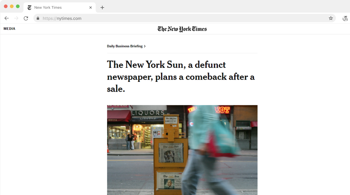
Now Let's get back to the actual Problem
The real challange was to design NYSUN's webiste with modern approach but at the same time keeping it traditional as it was in 1800's. So, we divided challenge into two parts, the overall user experience (Performance, scalability, and SEO optimization) and visual design.
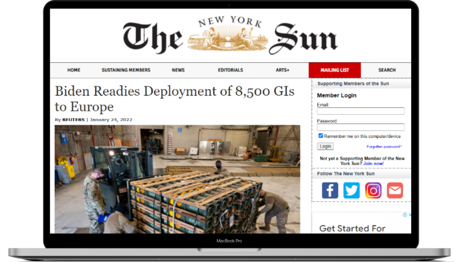
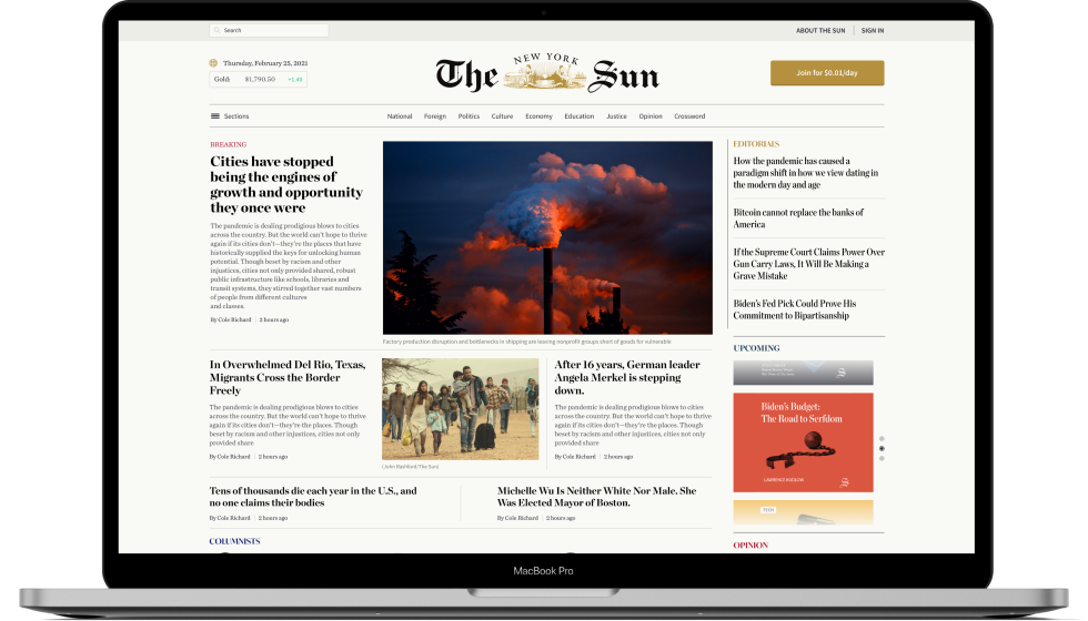
The Old Website

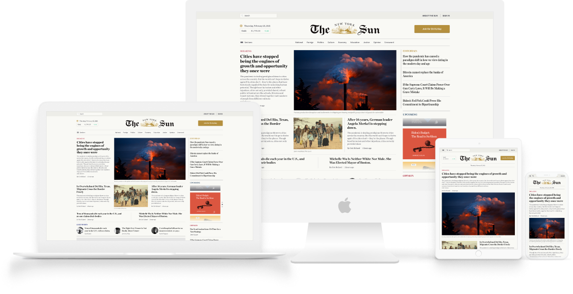
Homepage Design
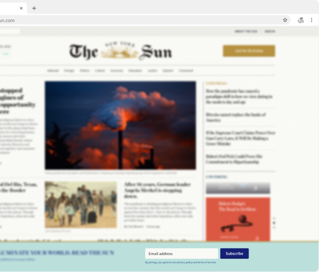
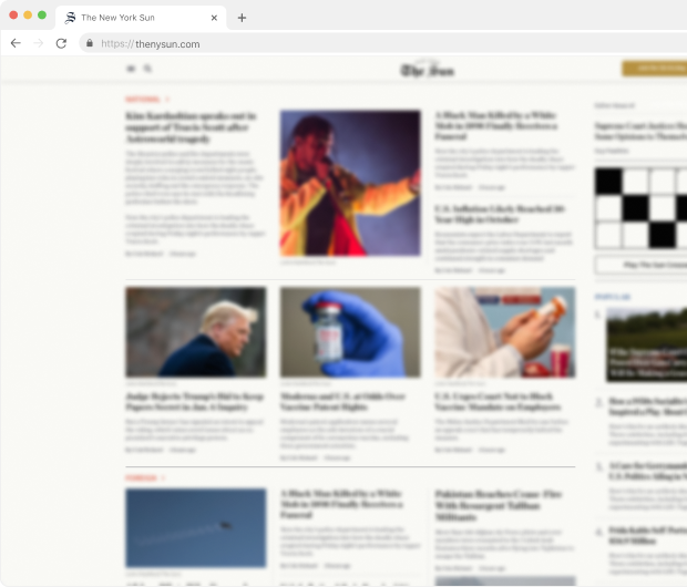
The Final Results

Homepage Design

Let's Dive into the Process
The design team worked closely with The New York Sun's core team to come up with the new design for their digital presence. Fast-forward all the brainstorming sessions and meetings that took into account the brand perception, technicalities, and the pace we had to move at.
Site Maps
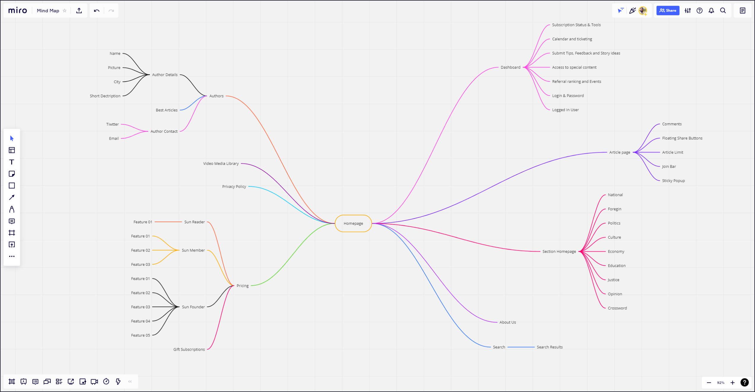
Brain Storming
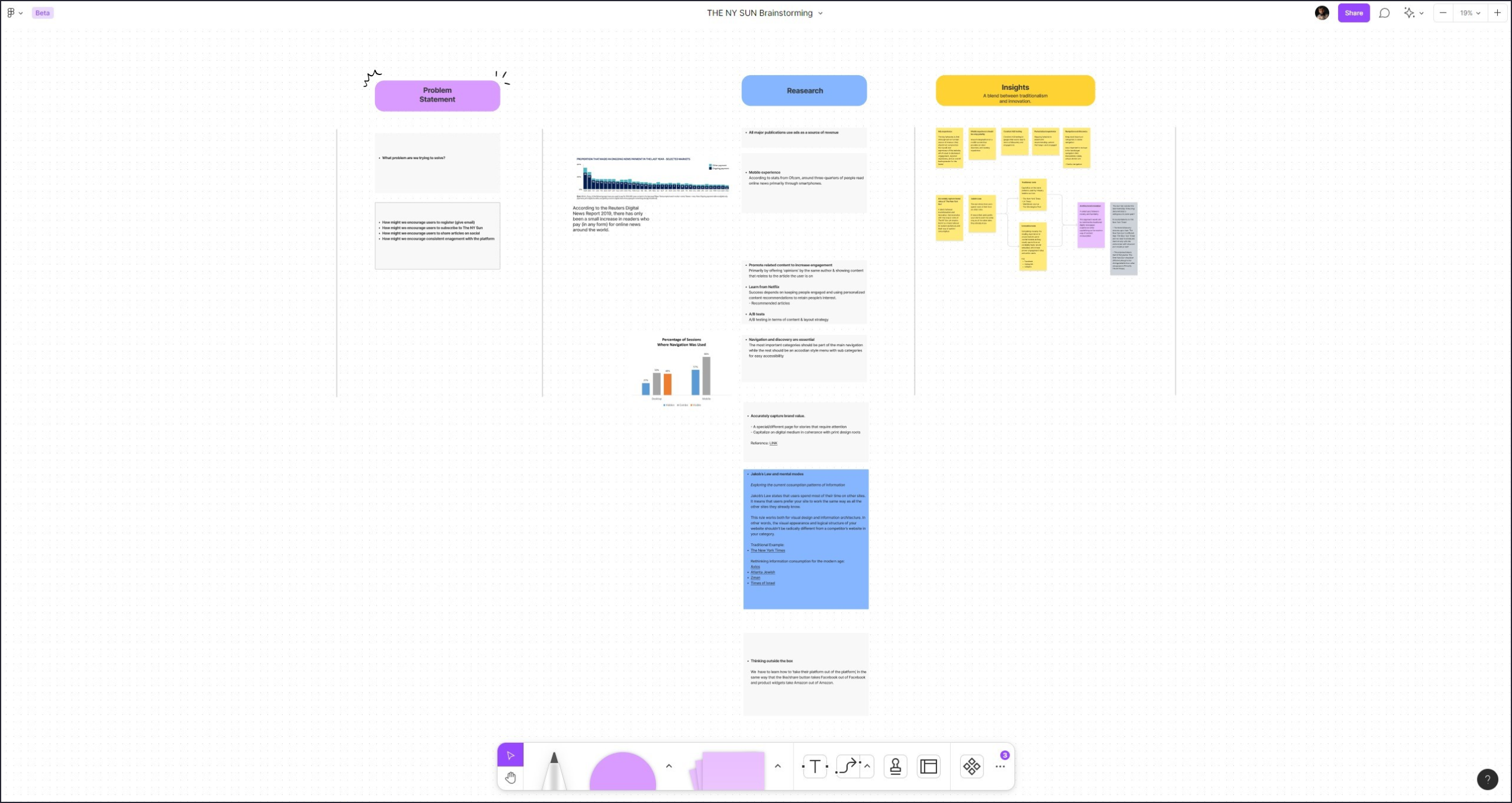
Some Important Highlights
Homepage Design


Balancing UX with business needs
For email capture and newsletter subscription we added sticky email capture above the fold that would stay wherever the user is throughout the website and page without obstructing user experience.

Seperating Sections
For the home we used light gray divider lines in between sections, and to differentiate between the sections we used dark grey divider lines.


Our Soultions are Business Oriented
One of the ways publications can generate income is through ads.
So, we studied and experimented with different patterns to integrate add space to meet business goals and optamizing user experience.
Article Page Design
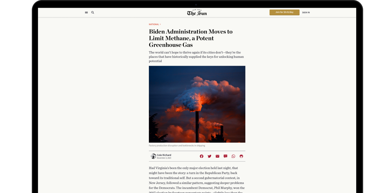
Optimal line Length
Optimal line length to increase the readibility of the articles is kept to 60-75 characters.


Static & Floating Share Buttons
We added static and floating share buttons to the inner article page so that the reader would have an opportunity to share their thoughts where ever they are on the page.
The Real Challenge
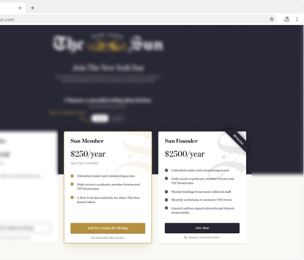
So the challange was to high light the Sun Member package while keeping the look & feel of the Sun Founder package even more premium & exclusive.
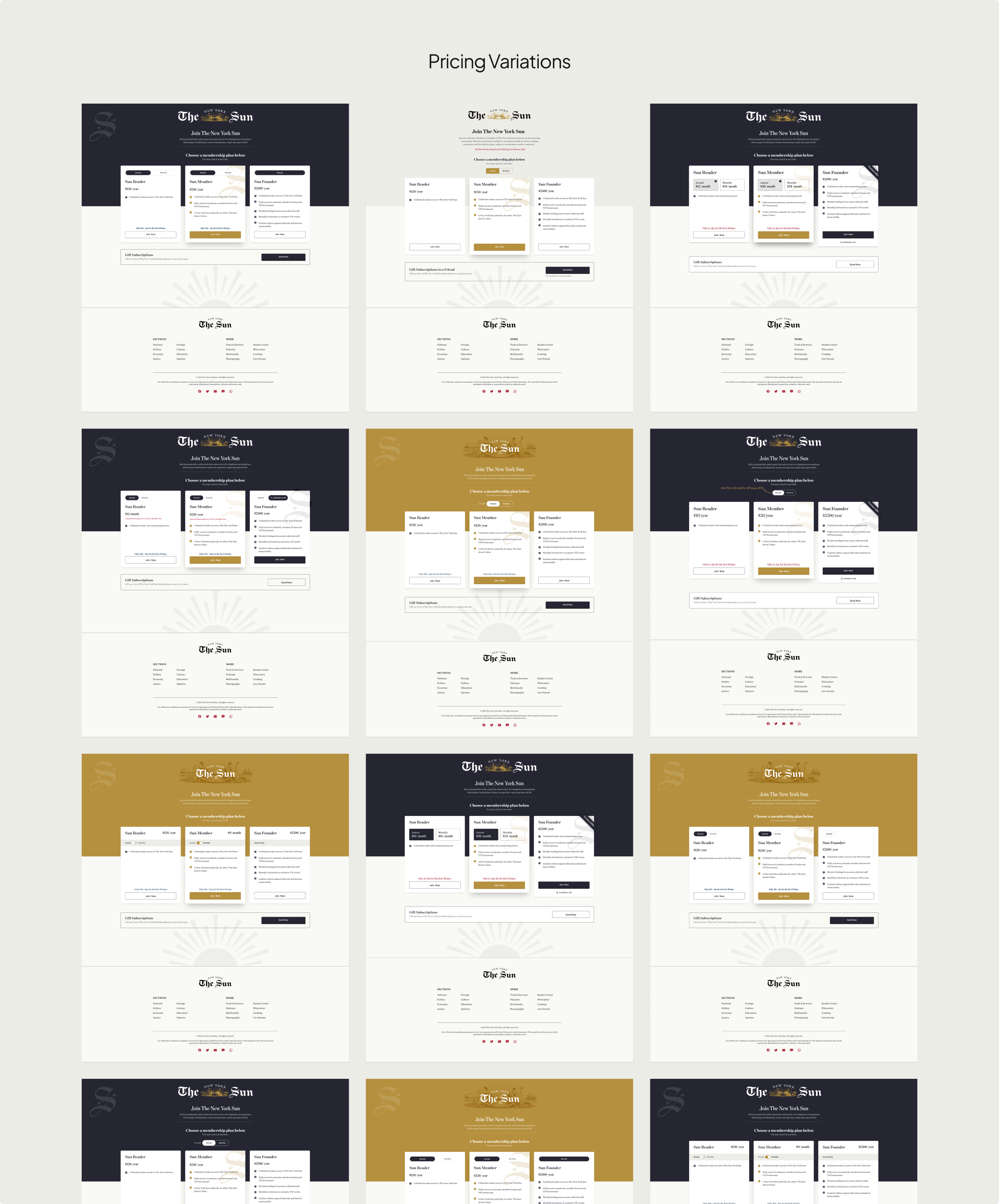
Pricing Page Design
The Final Design


Sun Member & Founder Packages
Through design and colors, a balance was created to emphasize each pricing plan, the users were unconsciously directed to “Sun member” without being oblivious to “Sun founder” that would give them a premium experience.
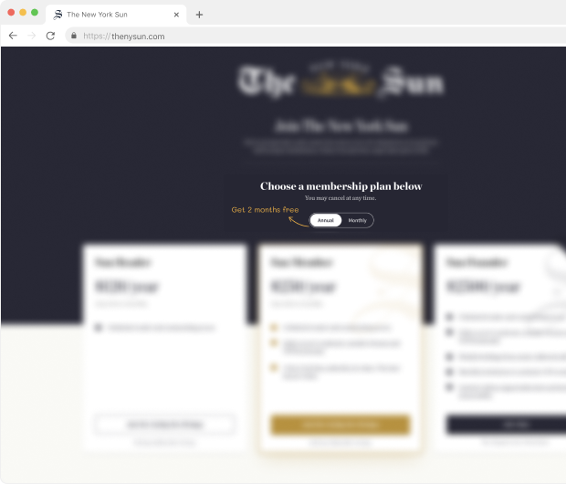
Annual & Montly Prices
For the home we used light gray divider lines in between sections, and to differentiate between the sections we used dark grey divider lines.


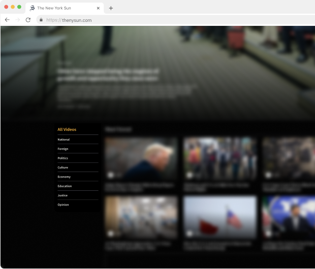
Media Library Design
During the design phase, we noticed that there were a lot of people who preferred to watch the
news rather than reading it.
So, we introduced a media library page where they would find the same news in a video format.
Media Library Design
Vertical Navigation
For the video and media page, we used a vertical navigation bar so the user can switch between sections easily without going back and forth.


Brand Store Design
During the design phase, we noticed that there were a lot of people who preferred to watch the
news rather than reading it.
So, we introduced a media library page where they would find the same news in a video format.
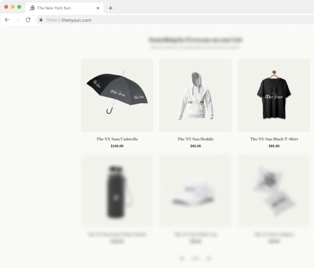
Store Page Design
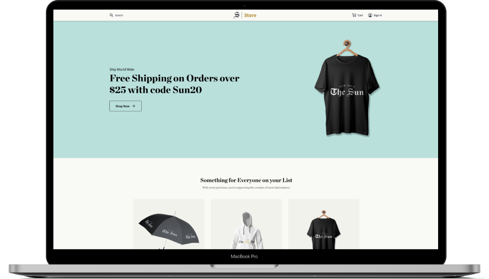
Simple & Minimal Design
Simple & Minmal design for branded products, so that customer can easily find what he's looking for & to keep the look & feel of the orginal brand intact.


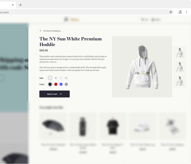
Product Details on Homepage
The don't have to leave the homepage to see the product details, as it's visible on the homepage when user clicks the product a screen from right with the product details appears with easy navigation.
Dashboard Design
Now, the dashboard was a real challenge because as mentioned before our users are above 35 years of age.
Dashboard Design


Minimal and Clear Design
Considering all the factors we designed the dashboard in a way that would minimize cognitive and motor load.